PenFed Design System
Role:Design systems lead
Team:
1 front end
2 Senior UX designers
Migrate and streamline the design system for design to market efficiency and consistency
How can we recreate the design system for design to market efficiency?
The Penfed design system is the backbone to our website. The system is outdated and is becoming uncompetitive as a system that is suppose to streamline the design process. Designers on the team have started to avoid using the system and handoff times have lengthened.
The Challenge
When our design systems lead unexpectedly departed, I saw an opportunity to step up. Despite being new to the team, I volunteered to take on the role. Within the first month I learn the existing system inside-out, migrated everything from Sketch to Figma, and then rebuilt it for improved usability and future scalability.
Problems with the design system:
Outdated components
Lack of style guide
and tokens
Lacks collaborative
coordination
Outcome
Sketch was the design platform of choice when I joined but quickly it has proven to be cumbersome and lacked collaboration support, and often plagued with connectivity issues. Therefore I made a case for migrating to Figma to be our new platform. With stronger cross platform collaboration tools and cloud support, designers can craft new user experiences in tandem while system updates are being performed.
Problems
- Component spacing discrepancies
- Outdated font elements and font discrepancies
- Complicated component naming convention
Solutions
- Defined spacing values across all components using 8px increments.
- Streamline font options and set usage rules
- Simplify component naming convention
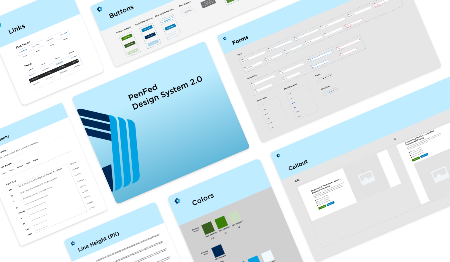
Before
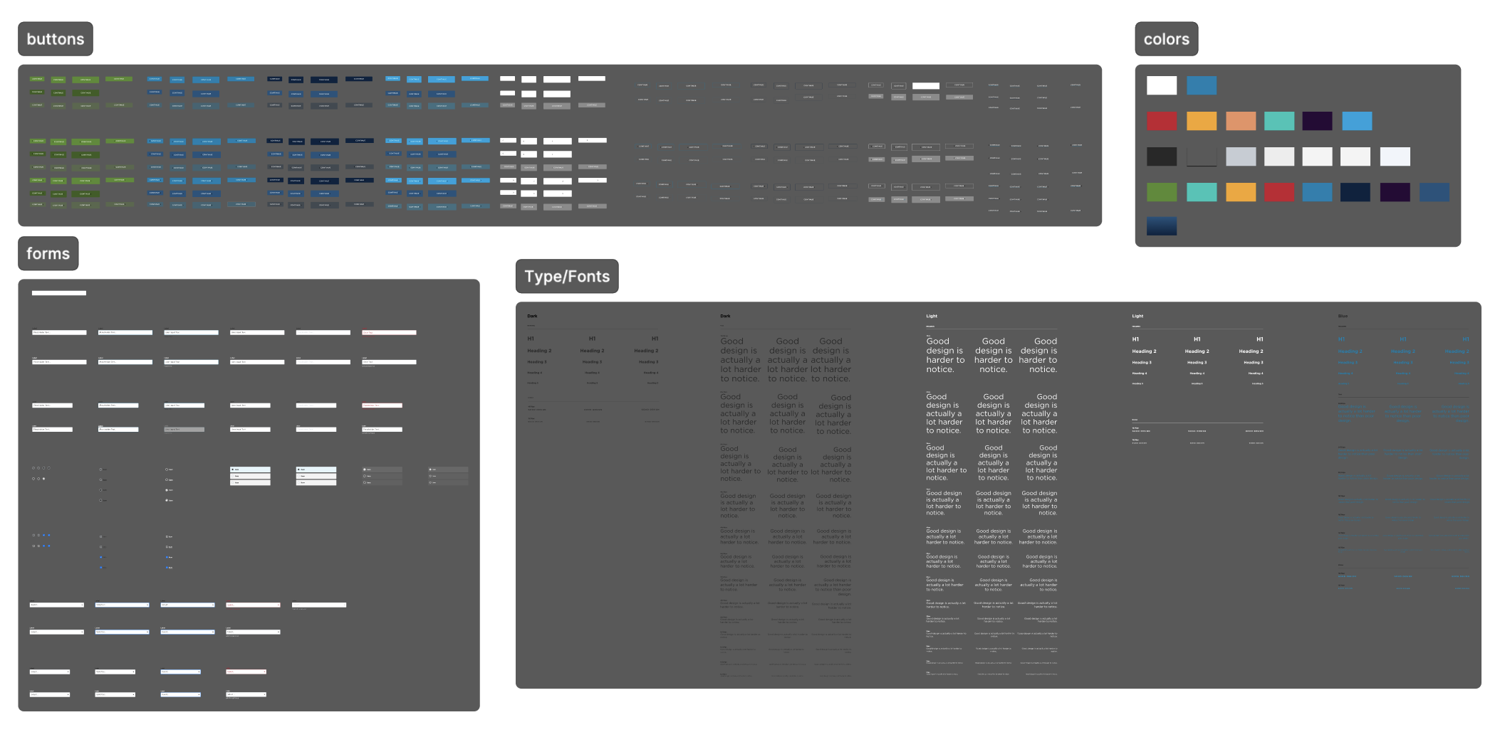
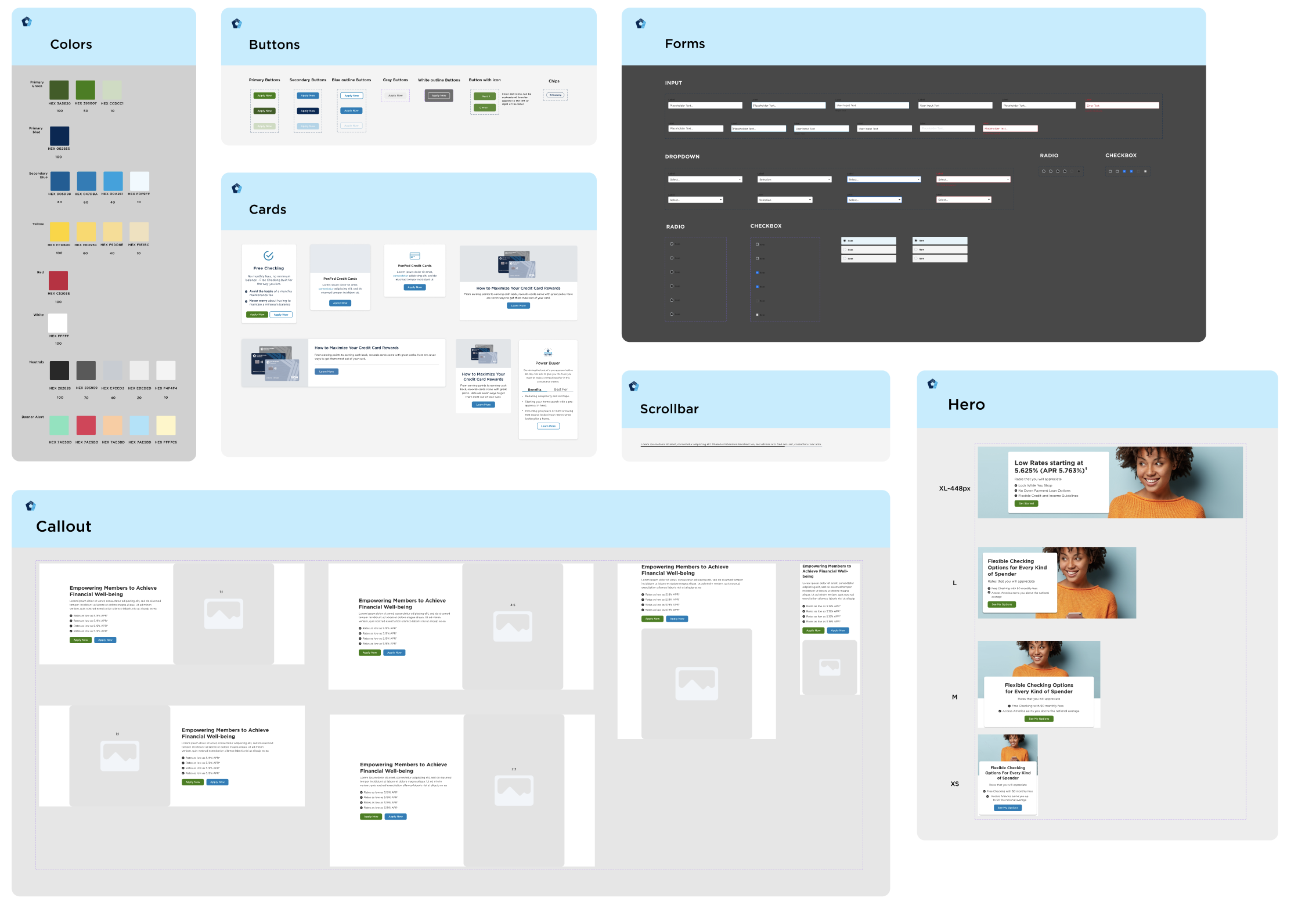
After
Approach
After migrating the design system to figma, it was evident that there were many inconsistencies with component spacing, font elements and grid alignment.
To address this, I spearheaded a comprehensive audit, restructuring the system's core elements. This included aligning components with our new grid and establishing clear, consistent naming conventions. These improvements ensured a seamless 1:1 translation from figma to our backend system (AEM).
What we did to solve the problem:
Sketch to Figma migration
Simplified naming
convention
Component
Streamlining
Tokenization
Simplified naming convention
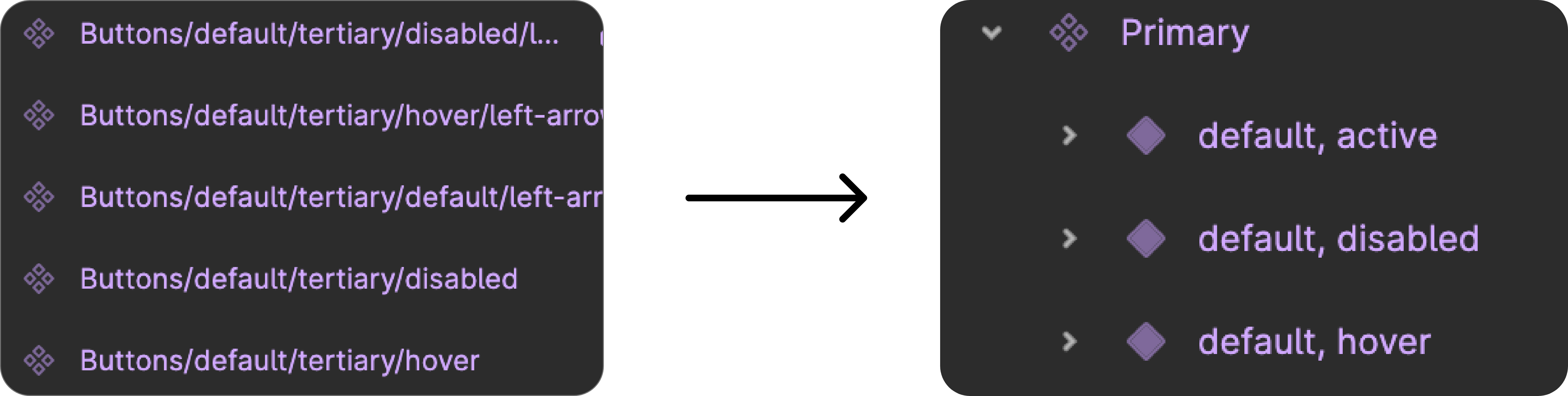
Our naming convention was very complicated and lengthy. By reducing the amount of button variations we were able to simplify our component naming convention that is easy to understand.
Component Streamlining
Our components were built without flexibility to accommodate content and copy, therefore multiple different sizes were built as a solution. Moving to a new platform allowed us to collaborate with engineers to build responsive components that would better tayler to the array of business requests our team creates designs for.
.png)
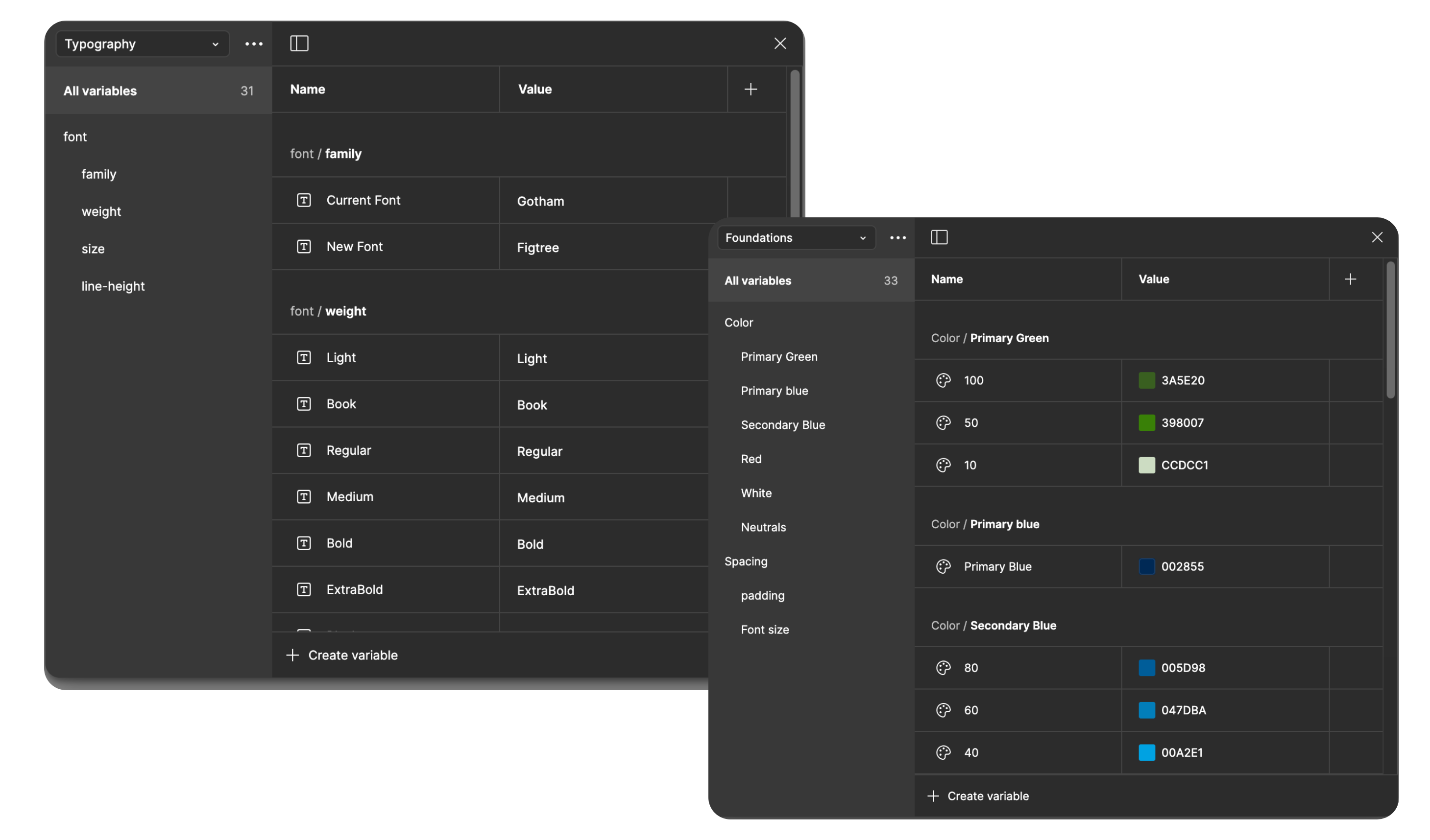
Variables and Tokens
Our design team work in 2 week sprints at a time so any time that can be saved in our workflow is invaluable to everyone. Utilizing variables and tokens within figma we were able to reduce design to handoff time by 50% with 70% less errors than before. We consolidated on colors that were used on majority of our pages and broke them down into styles for easy linkage with our components in the design system.
Design system automation
To better align design with our agile management process we implemented several key changes to our new system, including:
Local Styles
Developed a centralized style guide containing fonts, colors, and grids for easy access across all design projects. This consistency is essentia for PenFed's diverse business lines, where design needs can vary greatly.
.gif)
Variants and Auto layouts
Dragging and dropping atoms to build components can be time-consuming. I collaborated with our design team to optimize components using variants and auto-layouts, significantly improving efficiency in translating business requirements into user experiences without compromising component layout.
Templates
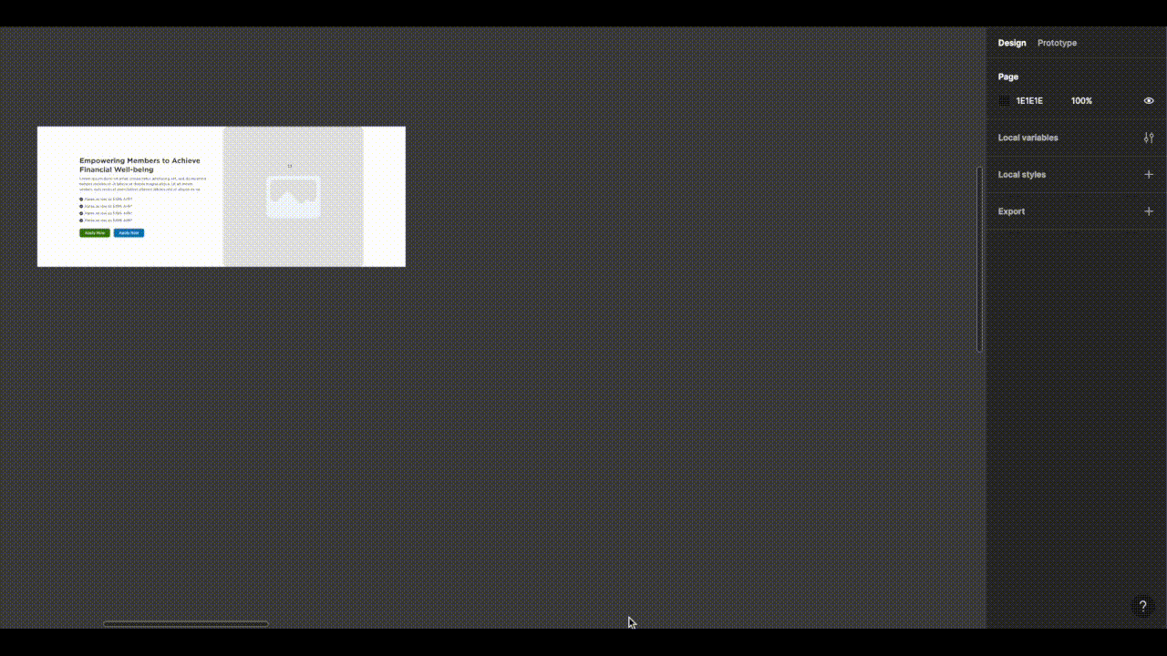
Repetitive page structures across product and non-product sections often slow down the design-to-market process due to stakeholder feedback and changing requirements. By implementing a templated approach, I aimed to decrease production time while preserving design consistency.
.gif)
Quick Snapshot
Leveraging the above mentioned features and tokenized components in our design system, we significantly reduced design-to-market time for standard pages. This freed up valuable resources for strategic design and future vision.
.png)
Component development workflow
.png)
This is how the component development process looks like. We try to stay within the confines of the design system but sometimes a new component or variant of an existing component needs to be created to meet the business needs.
Key Takeaways
- Reduced design to live production by more than 50%
- Worked in parallel with front and back end engineers on best practices of component development from design to implementation
- Mentored both designers and engineers on the best practices of how to properly implement and utilize a design system
- Editing and deployment of new components is more efficient which has lead to 60% quicker design implementation by designers.
